Little Lion Luxuries
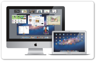
I’m sure the release of Lion will be accompanied by an entire pride of in-depth reviews. In fact, people have been doing warm-ups to get ready for John Siracusa’s mammoth review…
So, instead of digging too deep, or tackling any of the more controversial features — and it’ll be interesting to see which generates the most arguments out of Resume, Launchpad, iCal’s leather look, or just the new scrollbars — I’m going to touch on a few teensy, out-of-the-way Lion areas that I particularly like.
Photo Booth’s Four Quick Pictures

Photo Booth gets a refresh with Lion, most noticeably the Full Screen mode, with its wood panelling and curtains. But the feature I like most could easily pass you by. Photo Booth has always had a “take four snaps” photo mode, where you get the chance to take four poses. But it would only export the “four up” photo as a single photo, with all four snaps on it. Which is fine as a gimmicky shot, but not that useful per se.
With Lion, though, you get the choice. You can export the four-up ensemble as before, or click to zoom on any photo of the four and then export that photo individually — just drag and drop. Snap four sequential shots with a single click, and pick the one that works! As an avid DailyBoother, this is going to make my life easier.
Floating Dictionary Enhancements
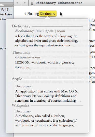 As with Photo Booth, the “floating dictionary” window is not new in Lion. It’s been around for years, but is one of the lesser-known features of OS X. In Snow Leopard, hover your mouse over a word hit Ctrl-Cmd‑D, and a little mini-dictionary pane floats up and defines the word for you, in Dictionary, Thesaurus, and Wikipedia.
In Lion, this dictionary has been given a makeover. The word you’re defining is highlighted in yellow, the pop-up is both snazzier and more informative, and, crucially, it’s easier to invoke.
Ctrl-Cmd‑D is still the keyboard shortcut, but you don’t have to be floating exactly over the word. For example, if you’re typing a document, hit Ctrl-Cmd‑D and you’ll define the last word you typed.
To go with all the other new touchpad gestures in Lion, there’s also a multi-touch shortcut for the floating dictionary — a double-tap with three fingers over a word will also bring up the dictionary. Quick, and, for me, easier to remember than Ctrl-Cmd‑D.1
All these little improvements have made for a much more useful Dictionary, especially for us keyboard geeks who don’t like reaching all the way over to the mouse do do stuff.
Draggable Page Width in Full Screen Safari

I’m quite enjoying Lion’s Full Screen mode on my tiny 11” MacBook Air. It’s definitely designed for these smaller laptops. On the other hand, some web pages have text that flows across the full width of the page, which can make lines way too long to read.
Apple have put some thought into this one, though, with my next little luxury. Open up a web page in Safari’s full-screen mode, and then push your mouse to the extreme left or right of the screen. Your mouse pointer turns to a little “sliding division” cursor, and you can squeeze the screen in from both sides until it hits a good width.
Bonus tip: in the rest of Lion, you can now drag from any edge of an app window or dialog box — top, bottom, left or right — to start resizing it. Also — thanks for the tip, @mattgemmell — hold down Shift or Option to constrain the resize. For example, Option-drag in from the left-hand edge of a window and the right-hand size will simultaneously squeeze in to match.
iCal Natural Language Parsing
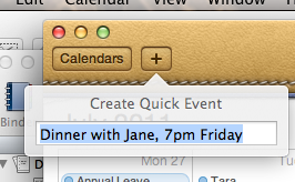
I’m straying onto the beaten track a bit here, but I want to mention iCal’s natural language parsing, because it’s a good keyboard-user-friendly change.
If you can bear to look at the new leather iCal, click that “+” button at the top. Now type “Dinner with Jane, 7pm Friday.” Pop! And there’s your new event, with the description, time and date ready-populated in the appropriate fields.
This kind of natural event entry will be familiar to users of Google Calendar. If you want to see it done really well on the Mac, try Fantastical.
Cute Greyscale Icons
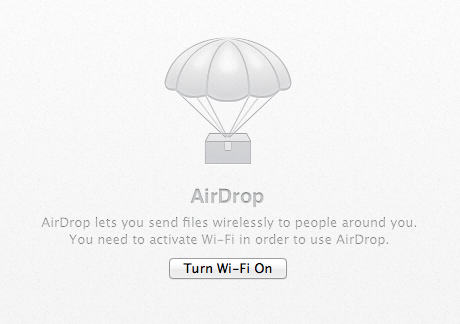
Cuteness
If you’ve used the new iTunes, you have a hint of what a lot of icons are like in Lion. Everything’s gone grey. Now, even if you miss the colour, I hope you’ll admit that someone’s clearly put a lot of time into these new greyscale icons, and I think they look pretty spiffy, especially the Finder and and Mail.app sidebar icons.2
But my favourite new icons have to be the big “something’s not quite right” icons. It’s just like Apple to pay attention to icons even in areas where they won’t be seen all the time. The big greyscale Safari icon that appears if you try to load a web page when you’re not connected to the internet is good, by my hands-down fave is the big cute parachute icon that appears if you try to use AirDrop without having Wi-Fi turned on: beautiful, friendly, and sitting inset in a subtle texture background.
About This Mac
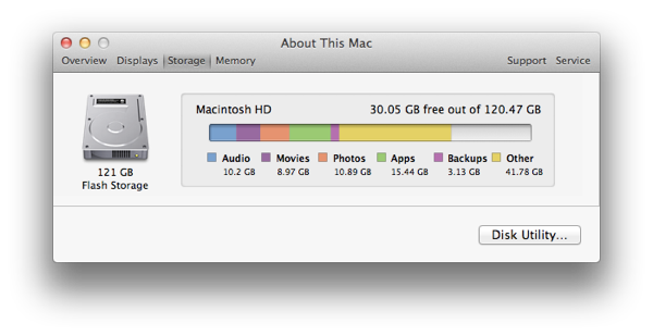
Finally, “About This Mac” (Apple Menu → About This Mac → More Info) gets a makeover. The part I most like is the Storage section, where you get a coloured-bar overview of your disk usage split down by category, very similar to the view of your iPod storage in iTunes. It’s a very pretty overview, even if most of my space is currently taken up by “Other” — this may be more useful for the non-geeks, whose files are probably a bit easier to categorise…
(If you want to see a really pretty disk space usage app, though, ignore the built in free stuff and give £13 to the developers of DaisyDisk, which is a gorgeous alternative to traditional treemap-style disk usage viewers.)
Geeks will be happy to know that OS X’s detailed System Information app is still available from the “System Report” button.
Conclusion
And that wraps it up for my little Lion luxuries. As I said, I tried to keep off the beaten track with these — have you encountered any more hidden gems in Lion that others might have missed? If so, leave a comment…
- Which I normally only managed to invoke on the second attempt, having hidden my Dock and sent some mail with the first couple of tries… ↩
- Incidentally, if you’re in Lion’s shiny new Mail.app and want to make its sidebar icons smaller, don’t waste time looking in Mail’s preferences. This is now controlled system-wide by the “Sidebar Icon Size” setting in System Preferences’ “General” area. ↩
1 Comment
Vijay
August 19, 2011I do quite like the grey icons! I also did find out that in Mission Control if you hover your mouse over a window or desktop and press space you can enlarge the desktop or screen so you can see whats on it a little better. Im not sure if this was in Snow Leopard but hey, at least its a new feature for me :P